Menu
Guidelines for signs on cultural heritage easement properties
Signs have always played a key role on commercial streets and on public and private buildings. Historically, most signs were customdesigned to match the architecture and style of a building, and sometimes were fully incorporated into the decoration. Sign makers used a limited range of materials, applying known and respected patterns and methods. Signs – using scale, media, illumination technology and intensity – were carefully incorporated into the architecture or became part of the building’s design from the beginning, as opposed to being an afterthought. The result was a visually coordinated and effective form of communication and branding that enhanced, rather than detracted from, the architectural context. Where possible, these principles should be used when contemplating new signs on heritage properties.
The following are guidelines for introducing new exterior commercial-style signs on heritage properties:
1. Signs should not overwhelm the other elements on a building’s façade.
2. Signs should be tasteful and as simple as possible.
3. Signs should not obscure heritage features (except, possibly, historical signs).
4. Where documentary evidence exists, the reconstruction of a period sign style formerly found on the property may be an appropriate approach in the design of a new sign.
5. Located above the display window(s) and below the storefront’s cornice, storefront signs should harmonize with the rest of the façade, and should only span one storefront.
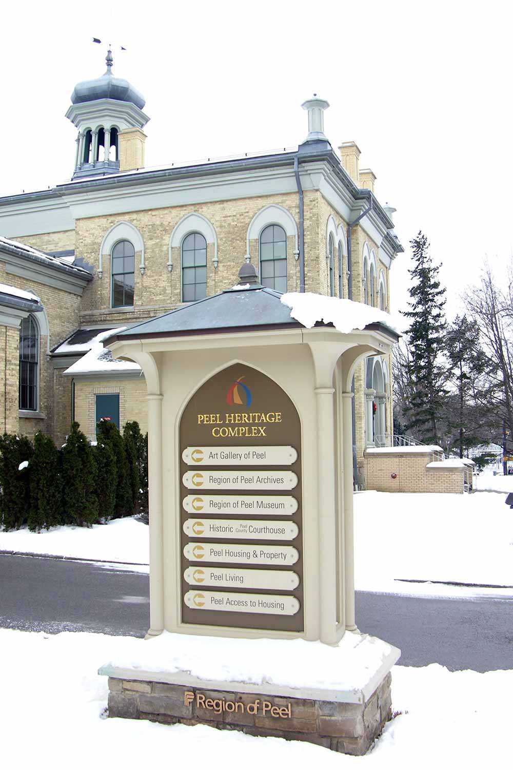
6. Where the architectural style or building type is not designed for signs, a pedestal or other form of stand-alone sign is preferable to fastening a new sign to the building.
7. When fastening a sign to a building, it is a best practice to use stainless steel hardware to connect to heritage fabric (i.e., the historical building envelop or structure). Where possible, on masonry buildings, mortar joints should be used if these are wide enough to accommodate the fasteners.
8. Signs should be compatible with their heritage context in both size and scale. For example, on a typical commercial city street in the late 19th and early 20th centuries, the characters in a sign band were often limited to 12 to 15 inches (approximately 30 to 38 cm) in height. On typical commercial heritage properties, signs should be limited to the sign band area of the building’s façade.
9. A projecting sign, such as a banner, should be limited to 6 inches to 1 foot (approximately 15 to 30 cm) from the face of the building. Where a pedestal sign is used, a person of average height should be able to reach the top of the sign (to a maximum height of 6 foot 6 inches, or 1.98 m). The average height of the text band should be around eye level, thus ensuring optimum human scale.
10 Signs should be compatible with their heritage context in choice of materials. For example, one should avoid fabricating a sign from materials that are not already present on the building or landscape. Materials consistent with the era of the building, and which are not present, may be appropriate.
11. Signs should be compatible with their heritage context in style. For example, a sign might take motifs or imagery present in the architecture and incorporate it into a new sign.
12. Signs should be compatible with their heritage context in colour. Generally, historical buildings have colour schemes that are carefully composed. Body, accent and harmonizing colours were specifically selected from a particular palette to complement one another and to enhance the interpretation of the architecture. The colours selected for a sign should relate to those already present on the building in palette, warmth and saturation. Modern colour intensities/saturations and finishes may not be appropriate for some heritage buildings.
13. Signs should be compatible with their heritage context in their illumination. Lighting for signs should be coordinated with the lighting of the property and building itself in order to create a balanced composition and a balanced nighttime interpretation of the historical property.
14. Most signs (especially on buildings built prior to 1925) should be illuminated from an external source, such as a ground-mounted spotlight, gooseneck light or floodlight.
15. Individual letters applied to, or painted on, the face of the signboard are, as a rule, more attractive and consequently preferable than sign boxes (i.e., fluorescent backlighting).
16. Unless the building dates from the second half of the 20th century, modern animated or other digital media signs should be avoided as they detract from the heritage character of the place.
17. Although the choice of lettering should reflect the business’s image, it should also reflect the overall design and historical period of the storefront.
18. Where a historical sign exists and is part of the architecture, it should be preserved. It might be overlaid by a new sign, but it should not be removed from the building if it has heritage value.
19. Way-finding and other smaller-scaled signs should also be designed for the heritage context as outlined above. It is generally preferable for these signs not to be affixed to the heritage buildings, but to be free standing.
20. For large sites – or collections of buildings that are part of a shared campus or site – it is preferable to develop an overall sign plan to ensure consistency in approach and to facilitate heritage approvals.
21. Sign approval should always be coordinated with municipal heritage designation bylaws and sign bylaws.